5 Signs Your Business Website Is Losing Customers (And How to Fix It)
TL;DR: Your website could be costing you thousands in lost revenue without you realizing it. 75% of users judge your credibility by design alone, and 89% of visitors abandon sites with poor user experience. Here are the 5 critical warning signs and exact fixes to recover lost customers and boost conversions.
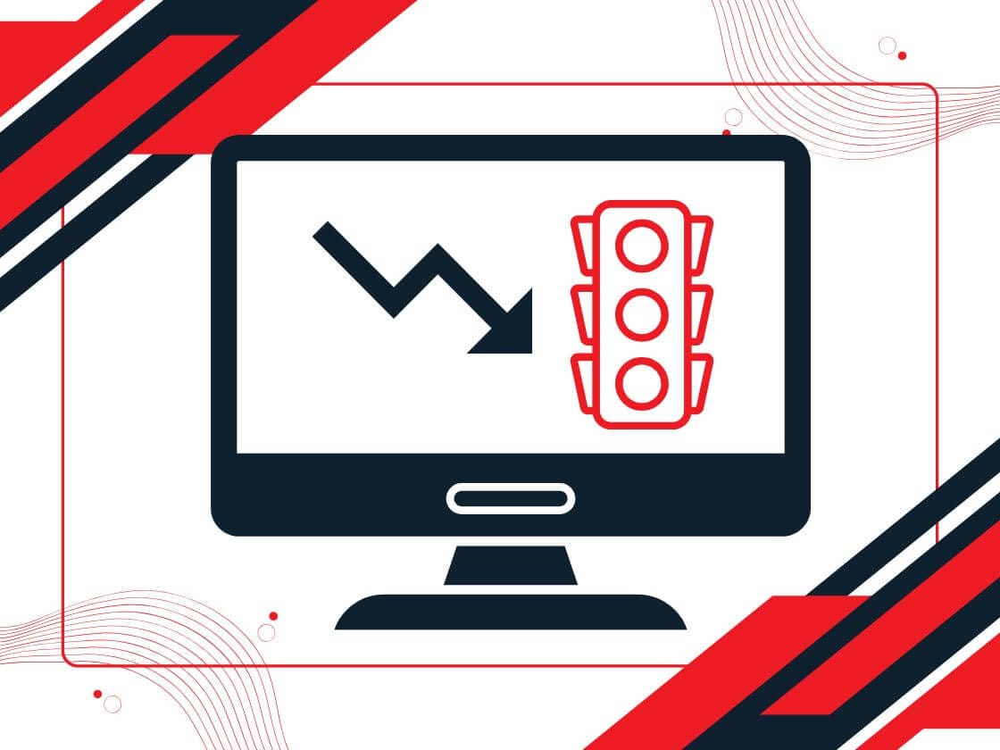
The Hidden Problem: Your Website Is Leaking Revenue
Imagine this: You’re spending money on Google Ads or LinkedIn campaigns. Prospects click, land on your site, and… nothing happens. They leave. No inquiry form filled. No demo booked. No quote requested.
This isn’t a lead generation problem. This is a website problem.
For B2B companies targeting Malaysia and Singapore, your website is often your first (and sometimes only) chance to convert a serious buyer. Your visitors make up their minds about your business in less than 3 seconds. If your website doesn’t pass that test, they’re already clicking to your competitor.
The unfortunate truth? Many Malaysian B2B websites are silently hemorrhaging customers.
Here’s what the data shows:
- Bounce rate of websites range from 45.68% to 65.52%, depending on sectors. That means half your visitors leave without taking any action.
- Poor user experience causes 70% of online businesses to fail, not because their services are bad—but because their websites don’t work.
- A one-second improvement in page speed increases conversions by 7% on Malaysian websites.
- 89% of consumers shop with competitors after a poor website experience.
The good news? These problems are fixable. And once you fix them, the impact is immediate.

Sign #1: Your Website Loads Like It’s Still in 2015
The Problem:
Your website is slow. Not “slightly slow”—slow enough that prospects get frustrated before they even see your value proposition.
Every second your site delays costs conversions. Studies show:
- Pages loading in 2.4 seconds achieve 1.9% conversion rates
- Pages taking 5.7+ seconds plummet to 0.6% conversions
- That’s a 70% drop in conversions for just 3 extra seconds
For buyers evaluating multiple vendors, speed signals professionalism. A slow site signals neglect.
How to Diagnose It:
- Test your site speed using Google PageSpeed Insights, GTmetrix, or Ahrefs.
- Test on 4G/LTE (not WiFi)—this simulates real Malaysian mobile users.
- Check your bounce rate in Google Analytics 4—if it’s above 50%, slow load time is likely a factor.
How to Fix It:
Lightweight Code is Your Secret Weapon
Many web designers in Malaysia build sites on page builders like Elementor or Divi. These tools add 100-300KB of unnecessary bloat to every page—slowing your site to a crawl, especially during traffic spikes or Google Ads campaigns.
At Solbright, we build B2B websites using block-based (WordPress native blocks) with zero page builder bloat. Block-based design is lightweight, clean, and maintains fast load times without sacrificing design quality. This ensures your site maintains <3 second load times even during traffic surges. It’s not about complex custom coding—it’s about smart, efficient code architecture that converts.
Quick Wins:
- Remove bloated page builders if you currently use them—migrate to WordPress native blocks or lightweight alternatives
- Compress images (use WebP format at least for hero image)—unoptimised images are the #1 speed killer
- Remove unused plugins and code—page builders like Elementor or Divi add 100-300KB of unnecessary bloat
- Enable caching—use Cloudflare or a CDN to serve content faster to Malaysian/Johor Bahru visitors
- Audit your plugins—each plugin adds weight; deactivate unused ones
- Upgrade hosting if needed—cheap hosting during peak traffic means lost deals
The Real Impact:
When one Malaysian e-commerce site reduced load time by 1 second, conversions jumped 7%. Multiply that by 100 monthly visitors, and you’re looking at recovering dozens of leads per month.
Sign #2: Visitors Can’t Find What They’re Looking For (Navigation Nightmare)

The Problem:
Your homepage is cluttered. Your navigation menu has 15 items. Prospects land on your site, spend 5 seconds looking for “Services” or “Get a Quote,” can’t find it, and leave.
This is the number 1 reason visitors bounce from B2B websites.
The Data:
- 37% of people abandon sites with poor navigation
- Sites with well-structured navigation see 200% higher conversion rates than those with messy menus
- Wakefit (a furniture site) fixed their navigation structure and saw 9% conversion increase in one week
When a buyer lands on your site, they’re on a mission: “Can I solve my problem with this vendor? How do I contact them? What does it cost?” If they can’t answer these questions quickly, they leave.
How to Diagnose It:
- Use heatmapping tools (Hotjar, Microsoft Clarity) to watch where visitors click and where they get stuck
- Check your Google Analytics 4—if users bounce after viewing only 1 page, navigation is likely the issue
- Do a simple test: Can a friend find “Contact,” “Pricing,” or “Services” in 5 seconds without help?
How to Fix It:
Structural Navigation Principles:
- Keep main navigation to 5-7 items max—every item you add increases cognitive load
- Group related services logically
- Prominent CTA placement—”Get Quote” or “Book Consultation” should be visible without scrolling (especially on mobile)
- Mobile-first navigation— ensure touch targets are large (48px minimum)
The Real Impact:
When you clarify navigation, session duration increases and bounce rate drops. Users actually explore multiple pages instead of leaving in frustration.
Sign #3: No Trust Signals—Visitors See “Unknown Vendor”

The Problem:
You have no reviews, no case studies, no certifications, no client logos. Your website looks professional, but it feels… empty. Like any random agency could have built it.
Buyers in Malaysia are risk-averse. They want proof. 75% of users judge your credibility by design and trust signals alone—before they read a single word about your service.
What You’re Missing:
- Client logos or testimonials
- Case studies with measurable results
- Industry certifications (ISO, MITI, etc.)
- Media mentions (“As Seen In”)
- Specific metrics from past work
How to Diagnose It:
- Go to your homepage and ask: “What proof do I have that this agency is legit?”
- Count visible trust elements—testimonials, case studies, certifications, client logos
- If you see fewer than 3 trust signals, this is your problem
How to Fix It:
Build Trust Signals Systematically:
- Client Testimonials & Logos
- Add 3-5 short, specific testimonials with real client names and company
- Display client logos (with permission) prominently
- Link to case studies or results
- Example (Bad): “Great company!”
Example (Good): “Solbright increased our organic traffic 240% in 6 months. Highly professional team. They delivered what they promised.” – Customer ABC - Case Studies with Numbers
- Share 2-3 detailed case studies showing the before/after
- Include specific metrics: traffic growth %, lead increase, revenue impact
- Show your process, not just results
- Certifications & Professional Credentials
- Display MITI registration, ISO certifications, industry memberships
- Include security badges if handling payments
- Social Proof Elements
- Star ratings (Google Reviews)
- Recent work samples/portfolio
- Media mentions (“Featured in”: TechCrunch, Digital News Asia, etc.)
- Transparency & Accessibility
- Visible phone number, email, physical address (Johor Bahru, etc.)
- Clear pricing or quote process
- Documented policies: returns, refunds, timeline
The Real Impact:
When e-commerce sites added customer reviews and testimonials, conversion rates increased by 15-20%. For B2B, the impact is even stronger because decision-makers rely heavily on proof before committing budgets.

Sign #4: Poor Mobile Experience (When 80%+ of Traffic Comes From Mobile)
The Problem:
Your website looks fine on desktop, but on mobile, it’s a disaster. Forms are impossible to fill. Buttons are too small. Text is hard to read. Checkout is a nightmare.
Here’s the reality for Malaysia:
- 65% of online orders come from mobile—on track to 80%+ by 2030
- Mobile websites have 51% bounce rate vs. 43% on desktop
- Mobile-friendly sites see 50% lower bounce rates than non-optimised sites
If your mobile site is bad, you’re losing 2 out of every 5 visitors.
How to Diagnose It:
- Open your website on a smartphone (test with 4G, not WiFi)
- Try filling out a contact form—is it easy or painful?
- Try clicking buttons—are they small or appropriately sized?
- Check Google PageSpeed Insights—mobile score should be >90
- Use Google’s Mobile-Friendly Test tool
How to Fix It:
Mobile Optimization Essentials:
- Form Optimization
- Reduce form fields from 10 to 4 if possible
- Use single-column layouts on mobile
- Auto-fill fields where possible (name, email, phone)
- Use input types that show appropriate keyboards (email, phone, number)
- Touch-Friendly Design
- Buttons must be at least 48px × 48px
- Spacing between buttons (minimum 8px) so users don’t mis-tap
- No hover states—use visual feedback (color change, slight scale) for touch
- Content Hierarchy on Mobile
- Hero section should clearly communicate: Who you are + What you offer + CTA
- Don’t hide critical info below the fold
- Stack content vertically (not side-by-side)
- Performance on Mobile Networks
- Test on actual 4G/LTE speeds, not WiFi
- Reduce image sizes drastically (mobile users have limited bandwidth)
- Lazy load images (load only when visible)
- Checkout/CTA Optimization
- Minimise steps to conversion (aim for 2-3 steps: Cart → Shipping → Payment)
- Enable multiple payment options (credit card, e-wallets, BNPL)
- Show progress indicators (“Step 2 of 3”)
The Real Impact:
Improving mobile UX can reduce bounce rate by 50% and increase conversions by 20-30%. For a B2B site with 1,000 monthly visitors, this could mean recovering 100-150 monthly visitors who previously bounced.
Sign #5: No Clear Call-to-Action (Visitors Don’t Know What to Do Next)
The Problem:
Your website has great content, but visitors don’t know what to do next. There’s no clear “Get a Quote” button. No “Schedule Consultation.” No urgency. They read, they scroll, and then they leave—forever.
This is called unclear conversion intent, and it’s killing more deals than you realise.
Common Mistakes:
- Multiple competing CTAs (“Learn More,” “Contact,” “See Pricing,” “Watch Demo”)—visitors freese
- CTA buttons are hidden or styled the same as normal links
- No clear next step after reading a service page
- Forms appear only on a separate “Contact” page (not embedded in service pages)
How to Diagnose It:
- Open a random service page on your website
- Ask yourself: “What should the visitor do right now?”
- Is there a prominent, clear button that says exactly that?
- Check Google Analytics—what’s your conversion rate? B2B sites typically aim for 2-5%
How to Fix It:
CTA Best Practices:
- One Primary CTA Per Page
- Every page should have ONE clear next step
- Service page: “Get a Free Quote”
- Blog post: “Download Free Checklist” or “Book Consultation”
- Homepage: “Start Your Free Website Audit”
- Make CTAs Stand Out
- Use contrasting colors (if your site is blue, use bright orange/green CTA)
- Make buttons larger (minimum 44x44px)
- Use action-oriented copy: “Get Free Quote,” not “Submit”
- Repeat CTAs Strategically
- Top of page: Small, fixed header CTA
- Middle (after value proposition): Medium CTA
- Bottom of page: Full-width CTA
- Don’t overwhelm—3 CTAs max per page
- Add Urgency & Incentive
- “Free 30-minute consultation” (urgency + benefit)
- “Limited slots available for Q1 2026” (scarcity)
- “No credit card required” (low friction)
- Micro-Conversions (Not Just Sales)
- B2B doesn’t always convert directly
- Offer alternatives: “Download Guide,” “Join Webinar,” “Get Audit,” “Schedule Call”
- Each micro-conversion builds the relationship
The Real Impact:
Clear CTAs with strong copy can increase conversion rates by 30-50%. For a site with 100 monthly leads, this could mean 30-50 additional qualified inquiries per month.

The Complete Audit: How to Know If Your Site Has These Problems
Here’s a quick audit you can do right now:
Sign | Check | Healthy Range | Your Site |
|---|---|---|---|
Speed | PageSpeed Insights Score (Mobile) | 85%+ | |
Speed | Bounce Rate (GA4) | <55% | |
Navigation | Can you find “Contact” in 5 seconds? | Yes | |
Trust Signals | Number of client testimonials visible | 3+ | |
Trust Signals | Number of case studies | 2+ | |
Mobile | Mobile-Friendly Test Score | Pass | |
CTA | Clear primary CTA on homepage | Yes | |
CTA | Conversion Rate | 2-5% |
Scoring:
- 6-8 checks passed: Your site is strong; focus on optimization
- 4-5 checks passed: You’re losing customers; prioritise fixes above
- <4 checks passed: Your website needs a complete audit (this is urgent) and potentially overhaul
Your Action Plan: Fix These 5 Signs in 90 Days
Week 1-2: Quick Wins
- Identify which signs apply to your site
- Add 3-5 client testimonials with specific results
- Create 1-2 detailed case studies with metrics
- Simplify navigation to 5-7 items max
Week 3-4: User Experience Improvements
- Audit and optimise mobile experience
- Reduce form fields to 4-5 maximum
- Make primary CTA more prominent (larger, contrasting color)
- Test page speed; identify and fix slow elements
- Add breadcrumb navigation
Week 5-8: Strategic Improvements
- Upgrade hosting if needed (consider NVMe-based hosting for speed)
- Build additional case studies
- Create downloadable resources (guide, checklist, template) as micro-conversions
- Implement heat mapping to identify new friction points
- A/B test CTA copy and placement
Week 9-12: Monitor & Optimise
- Track changes in bounce rate, session duration, conversions
- Use Google Analytics 4 goals to measure form submissions
- Collect user feedback (surveys, chat, email)
- Iterate based on real data
The Bottom Line: Your Website Is Costing You Real Money
We have spoken about how not having a website costs you money. But equally costly? Having a website that doesn’t convert. Every day your website has these issues, you’re losing customers:
- Prospects leaving because your site is slow
- Visitors bouncing because they can’t navigate
- Decision-makers not trusting you because you lack social proof
- Mobile users abandoning because forms are painful
- Interested prospects not knowing what to do next
The good news? These are all fixable problems. And when you fix them, the ROI is immediate and measurable.
Your next step isn’t to overhaul your entire site. It’s to audit your site against these 5 signs, prioritise the biggest problems, and fix them.
Need Help Diagnosing Your Website?
If you’re a B2B company in Johor Bahru, Klang Valley, or Singapore struggling with website performance, lead generation, or conversions, Solbright Digital Services can help.
We specialise in:
- Website audits (speed, UX, conversion optimization)
- Mobile optimization for Malaysian business buyers
- Conversion rate optimization (CRO) that actually works
- Building fast, lightweight websites without bloated code
- B2B website strategy for Malaysia and Singapore markets
Get Your Free Website Performance Audit – We’ll analyse your site against these 5 signs and give you a specific action plan with estimated impact.