What is a Responsive Website Design, and Why It Matters for SMEs
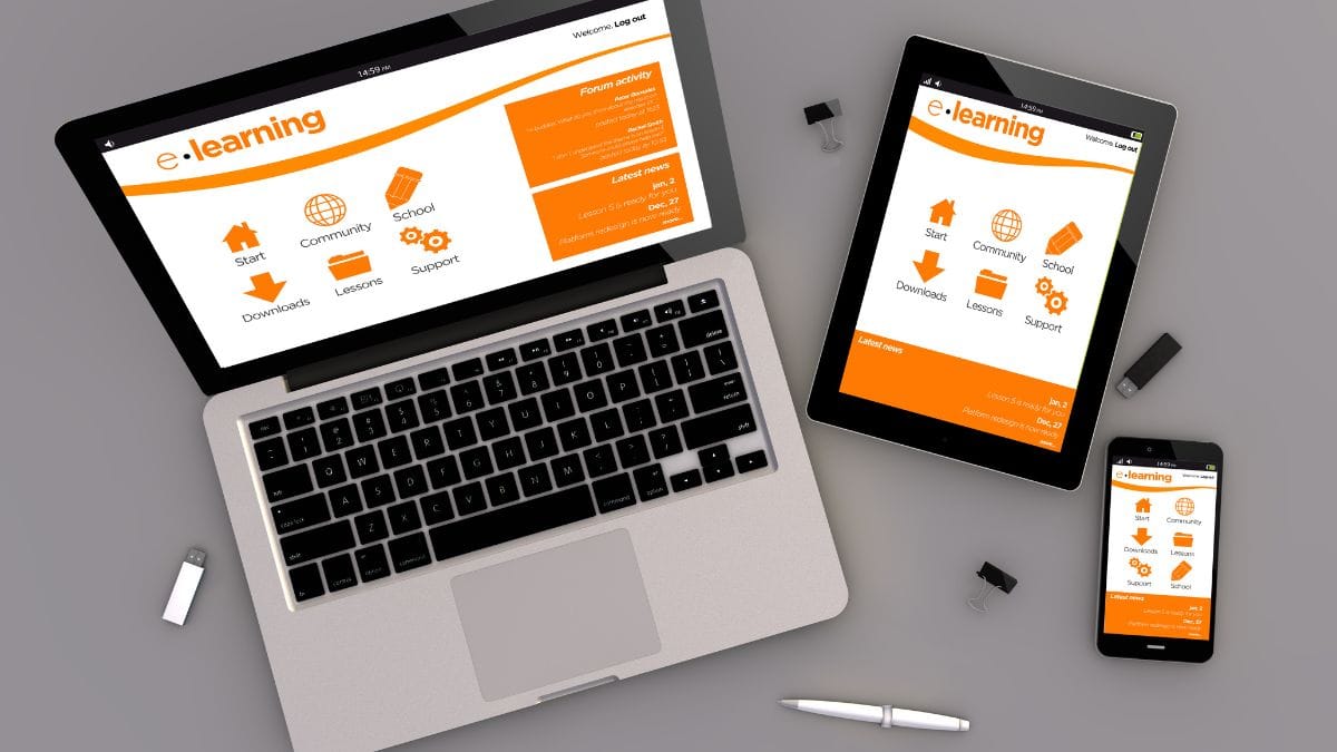
In today’s digital landscape, having a website that looks great and functions smoothly on all devices is no longer a luxury — it’s a necessity. A responsive website design ensures that your website adjusts seamlessly across different screen sizes, whether it’s viewed on a desktop, tablet, or mobile phone.
For small and medium enterprises (SMEs), this is especially important, as a large portion of online traffic now comes from mobile devices. Let’s dive into why responsive design is crucial for your business and how it can positively impact your customer experience.
What is Responsive Website Design?
Responsive design means that a website is built to automatically adapt to different screen sizes, orientations, and resolutions. Whether your visitors are using a desktop computer, smartphone, or tablet, the website will provide an optimized viewing experience with easy navigation, minimal scrolling, and a clear, accessible layout.
This approach eliminates the need for separate versions of your website for mobile and desktop users, making it easier to manage and ensuring a consistent experience across all devices.
Why is Responsive Website Design Important for SMEs?

- Increased Mobile Traffic Did you know that more than half of global web traffic comes from mobile devices? According to Statista, mobile traffic now accounts for over 62% of total website visits worldwide, and this trend is only growing. If your website isn’t optimized for mobile, you’re missing out on a significant number of potential customers.
- Improved User Experience and Conversion Rates A responsive website ensures that users can easily navigate your site, regardless of their device. This seamless user experience is crucial in converting visitors into customers. Research by Google found that 53% of mobile users will abandon a website if it takes more than 3 seconds to load. A responsive site helps improve loading times and reduces bounce rates, making your site more likely to keep visitors engaged.
- Boosts Your SEO Google favors mobile-friendly websites in its search rankings, particularly since its shift to mobile-first indexing. This means that if your website isn’t responsive, your search engine visibility could take a hit. Having a responsive design can help ensure that your business is easily discoverable by both mobile and desktop users.
Conclusion
A responsive website design is crucial for SMEs that want to stay competitive in today’s mobile-first world. Not only does it improve user experience and conversion rates, but it also boosts your search engine rankings, making it easier for potential customers to find you online.
If you haven’t yet optimized your website for mobile devices, now is the time to make the switch. Solbright can help you design a responsive, user-friendly website that ensures your business is accessible to all customers, no matter how they access your site.
Ready to Optimize Your Website?
At Solbright, we specialize in creating responsive websites tailored for Malaysian SMEs. Let us help you provide a seamless browsing experience for your customers.
Let’s Build Something Great Together
Solbright offers affordable website design and maintenance services from RM788 for Malaysian small and medium businesses. Whether you’re starting from scratch or upgrading from social media, we make it simple and stress-free.
Explore our website packages and reach out to us now!